
Dear Popstar,
We know you think we don't understand what it is like to be you. But we do understand and we want to help. We don't want your life to be hard when it doesn't need to be.
Today we want to talk to you about creative control.
Sometimes people will attempt to piss on your chips. Your label or your management or your whoever will say "look do you know what, we appreciate your input but this just isn't quite right for where you are in your career at the moment, have you thought about doing it like this?".
For example with artwork, they'll show you some ideas you don't really like very much because they are not Your Own Creative Ideas and you'll feel as if you're being forced into being represented in a way that isn't true to your vision.
"FINE JUST WRAP THE CD IN PAPER MADE OUT OF DRIED WOVEN SHIT THEN IF YOU WANT," you will sometimes say, and you will storm out. But sometimes you will want to insist that you are right. Sometimes you will want to stand your ground. Sometimes you will want to say: "I've done what you've said so many times, just give me this one." And you will state that you and only you really know how your music should be represented.
You will start throwing around the names of your favourite fiercely independent artists whose visions have been followed. That's fine. But are you really Patti Smith? Are you really Paul Weller? Are you really Bjork?
Are you any of those artists?
OR ARE YOU SEAN PAUL.
What we would like to do today is talk you through Sean Paul's recent creative work on the packaging for his album, 'Tomahawk Technique'. First off, let's be very sure about whose creative vision we are discussing here. On the sleeve to 'Tomahawk Technique' it is stated, quite clearly:
Conceptual Design and Photographs: Sean Paul
So now we've established whose creative mind is behind all this, let's see what he came up with.
Let's begin, of course, with the cover itself.
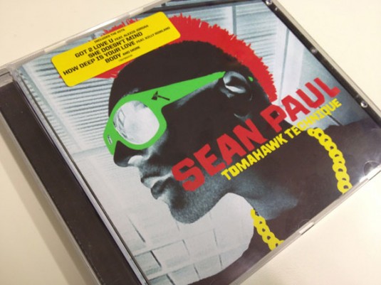
Popstar, please look long and hard at that photograph. We could have done this with Lady Gaga's 'Born This Way' artwork but the problem there is that it does have some redeeming features, and what we really needed to make our point was album artwork with none.
We needed something rare: a creative work to which the concepts of right and wrong can actually be applied. Sean Paul's 'Tomahawk Technique' has objectively bad album artwork. We don't need to describe it or talk you through what is wrong with it. We know that you know, and knew in a split second, that it is bad. There is no way anybody could think it was anything other than bad.
Remember:
Conceptual Design and Photographs: Sean Paul
Let's move on to the reverse of the CD, because having won the battle with his label about the front cover, presumably Sean was happy to meet them half way and let experts take over the design for the rest of the package, right?
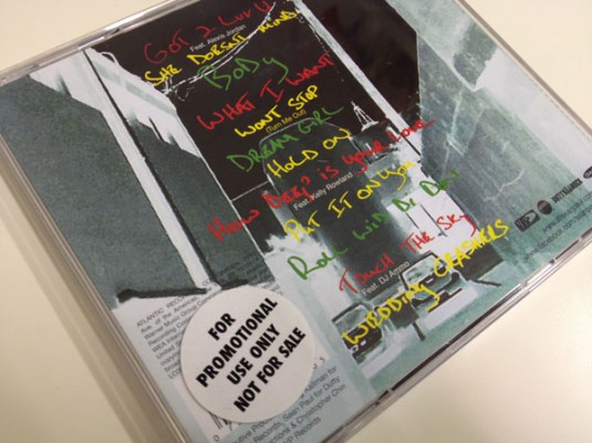
Well we suppose it makes sense that Sean would want the front and reverse of the CD package to complement each other. After all, you can't just have half an artistic vision! The front and pack of a jewel case are like the yin and the yang of music industry graphic design. That's completely understandable.
He'll let the label look after what happens inside though, right? After all he's Sean Paul. He's busy! He's got songs to be making. Just leave the inner design to the professionals, right?
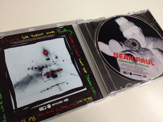
And so it continues.

Still, at least with those big blocks of colour he's making the most of the pricier colour printing his label have (in these tight financial times) generously splashed out on.
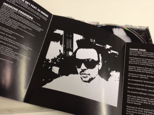
One bit of the booklet left — let's not waste it! Let's really change things up!
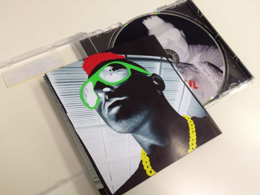
But wait. There is one part of the design left. The part that true fans treasure above all others.
We are of course talking about the little surprise you get when you remove the CD from the jewel case and, underneath it, is a treat. A photo, a logo, maybe some lyrics. Perhaps even something completely surprising!
Let's see what Sean Paul has 'planted' for his fans.
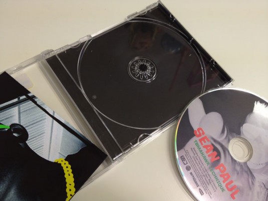
Let's refresh our memories:
Conceptual Design and Photographs: Sean Paul
To any popstars still reading this, we know this letter has been longer than most of the 140-character missives you encounter, and we are grateful that you have taken the time to stick with us. We think that if you've got this far it's because you genuinely want our help.
So we will leave you with this advice. Next time you are thinking that you should have your own way, just remember Sean Paul.
We are not telling you that it is wrong to be creative. We are not telling you to fear the consequences of being artistic. Sometimes your instincts will be right, and you should fight for what you think is important.
But sometimes you will be Sean Paul.
We've made a little cut-out card for you. If you like, you can click the picture and print it out — it should be just the right size to fit in your wallet or purse.
With much love,
Popjustice
xxx
