While the rest of the world debates whether or not 'Black & Gold' is rubbish because it doesn't have a chorus (FYI it is not rubbish and it does have a chorus) or whether the new video is too gay/not gay enough, let's turn our attentions to Sam Sparro's new logo.

Good things about this logo:

» Nice diagonal lines.
» Nice vertical lines.
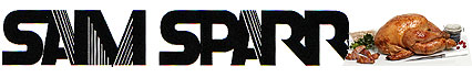
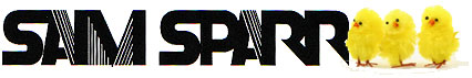
» BIRD ALERT! BIRD ALERT! The reason for this is that Sam Sparro is called Sam Sparro and a sparrow — which is like the word 'Sparro', but with a 'w' on the end — is a bird.
The good thing about the bird is that the logo can be adapted for various occasions and events.
Christmas!
Easter!
Men falling off roofs!
We give this logo 8/10.