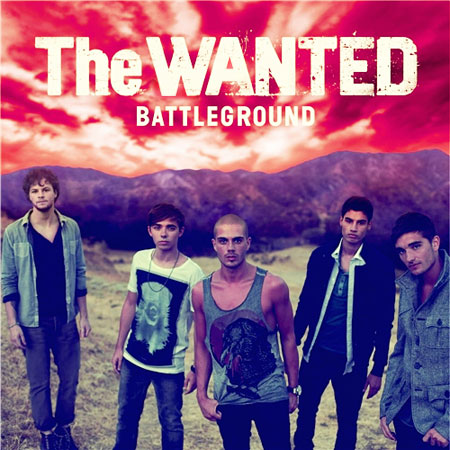
1. The logo. It's really time to get this sorted out. Yes we know it was important at the start to establish that the band were a bit rough around the edges and bold and all that sort of thing but we get the idea now, how about we all move on to a logo that actually looks nice?
2. The title font. Let's have it either identical to the logo font, or completely different. This almost-the-same-but-not business just isn't going to cut it.
3. The 'don't do something just stand there' thing, with Jay and Tom the worst offenders. YOU'RE HAVING YOUR PHOTO TAKEN LADS PAY ATTENTION. At least Max and Nathan are doing some Proper Standing. We'll let Siva off.
4. Red sky at night, album cover's shite / red sky in the morning, the true awfulness of this album cover is just dawning.
5. The overriding feeling that this is just a picture of some
chaps standing about and just happened to end up being used as a
packshot. A packshot! Not even artwork. PACKSHOT. A feeling made all the more acute by…
6. …the fact that the hole in the 'A' and the left dangly bit of the 'W' have light bits of sky behind them, meaning 'THE WANTED' looks like it's just been carelessly slapped on there and doesn't stand out properly which is all the more annoyingly when you consider how easy it would have been to add a bit of dark sky like this.

Not perfect but it took us precisely 45 seconds. (Don't even get us started on the 'UND' bit of 'Battleground'.)
7. We're undecided on whether 'Battleground' should actually be two words or not. Two words would have more impact. We'll get back to you on this — if someone could tell Island to pause production of physical copies until we've decided that would be great and could save a lot of wasted booklets if we decide two words is best.
8. Thanks.
By the way, this is how to make everything better.

Easy.
Here are clips of the songs from the album. Some are good, some are bad.