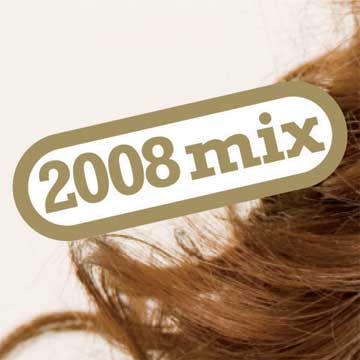
This is the sleeve for Miley Cyrus' new (in the UK) single, 'See You Again'.

The track is brilliant…
[audio:seeyouagain2.mp3]
…but Christ alive what about that sleeve.
The will-this-do, not-even-at-an-angle-one-might-describe-as-'jaunty' inclusion of '2008 mix'.

The 'doesn't really fit in the bottom right hand corner but let's just keep the point size and chuck it in regardless' title and artist. "What this also needs is a star for no reason."

And finally…

Be warned: you'll be seeing a lot more of this sort of thing as single and album sleeves become no more than 24kb iTunes graphics, passed from intern to intern as record labels cut budgets. :(