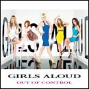
Based on a tiny picture we have just stolen from the HMV website…

…it is shit. Why is 'Girls Aloud' on it twice? Why does it look like they've used a press shot from around the second album? What is going on with that font? Why's there a stupid white border at the top and bottom? RIDICULOUS.
If you would like to have a look at the picture in the context of the HMV site, the link to do that is this one.